
GrowTogether is a conceptual non-profit organization focused on supporting and encouraging the establishment of community gardens. The goal is to enhance local neighborhoods by fostering a sense of community and providing access to fresh produce. The organization aims to streamline and improve the user experience for booking and outreach processes on their new desktop site. By recognizing the need for better organization and collaboration within local communities, GrowTogether seeks to create a platform that effectively connects people and resources for the greater good.
Duration
4 Weeks
Tools used
Figma, Adobe Illustator, Adobe Photoshop
My Role
I conducted user research including interviews and workflow analysis to understand needs. I then designed and prototyped high-fidelity interactive prototypes in Figma, developing responsive web and desktop interfaces following a mobile-first approach, and worked closely with developers to ensure the design was feasible and tested well with users.

Climate change is taking its toll on society through natural disasters and record-breaking temperatures. The need to increase our green footprint is imperative. Community gardens are a great way to combat the massive carbon footprint left so far.

The goal is to create a website that serves as a central hub for individuals passionate about community gardens and environmental sustainability. Through a user-friendly interface and streamlined user flows, the website aims to facilitate volunteering, donations, and education about community gardens.


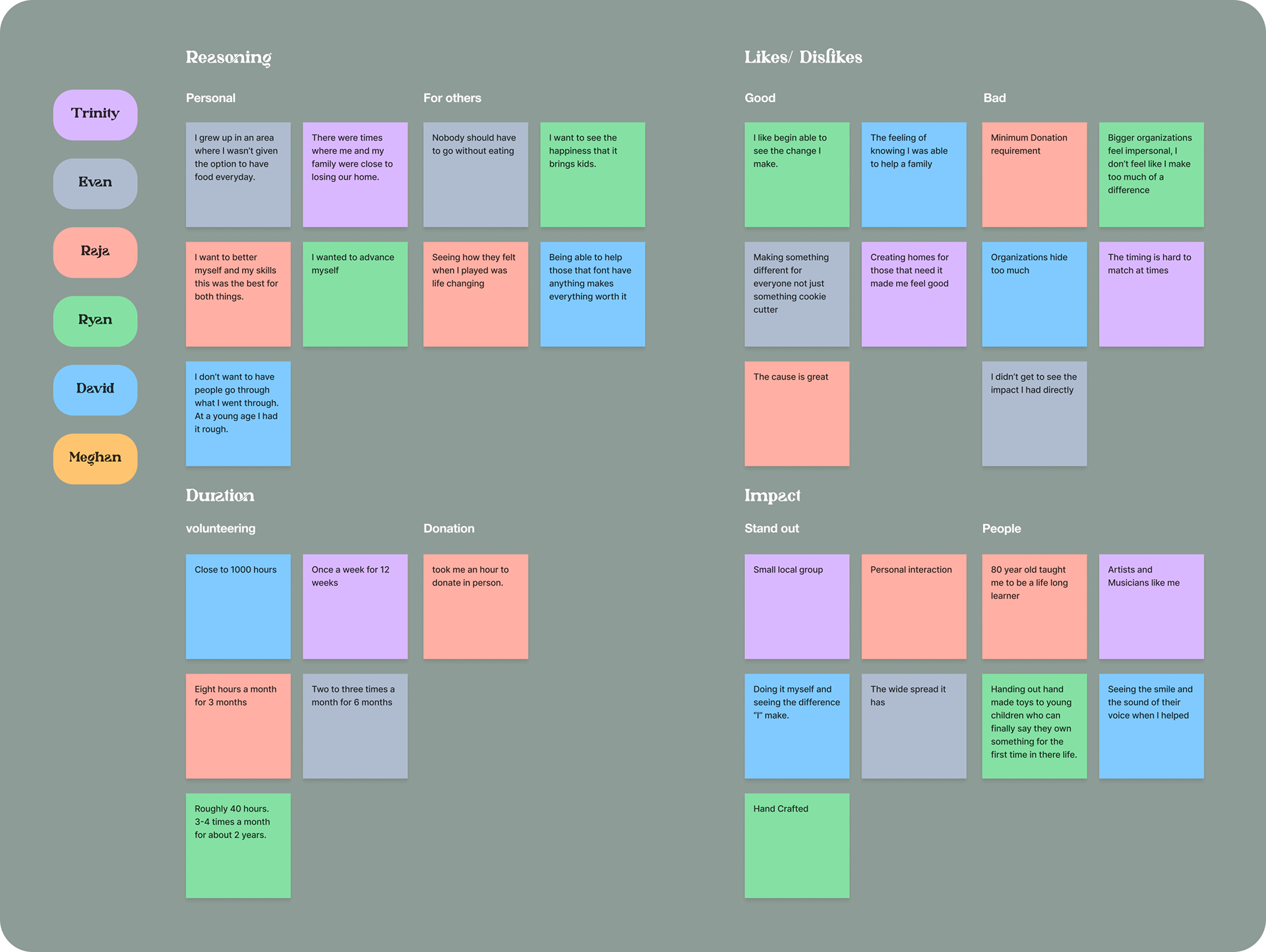
While GrowTogether is a conceptual project, I personally reached out to many people who had experience and understood the challenges when working with other non-profits or charities. I was able to interview up to 7 participants which included those who regularly volunteer using their time also those who donated to many different non-profit organizations.
Sample questions used:
1. What challenges did you face while looking for something that you wanted to back?
2. How do you feel your efforts went?
3. What did you feel made the non-profit unique and stand out to you?
4. What drew you into agreeing with the values of these organizations?
5. Tell me did you find a memorable experience while donation or volunteering?
These where some of the insights attained from these interviews:
• They found that many charities that have become large and well known lose focus on there values easier.
• They all agreed that transparency within the organization is a must have.
• They felt that efforts that they put in where going unnoticed.
• They said that they felt a need to play their part in something bigger.
• Many of those who volunteered tend to have an outgoing personality.
• Those that donated said they did it when they were unable to give their time.
• They said that smaller groups where more down to earth and about the values they preached.
• Users felt that efforts where more ned by smaller groups overall.

I took my time to use a few different organizations to see how similar concepts went about bringing in volunteers, marketing there organizations to be unique, and ways that they made donations look appealing to the targeted audience. After this analysis I followed it up by looking at other’s reviews on the organizations and site’s to come to see the most common
issues:
• Either too cluttered UI or too plain, non interactive UI.
• Text heavy areas that made it hard for engagement.
• Donation forms all similar and lead to overused designs
• Users should be able to have more of a choice in how much they can give through the site itself.
• Visual design was lacking in most sites.


I took the information I gathered during my initial interviews with the participants to condense everything down into something more visual to help me better gain insight on what each participant wanted and felt could be better.

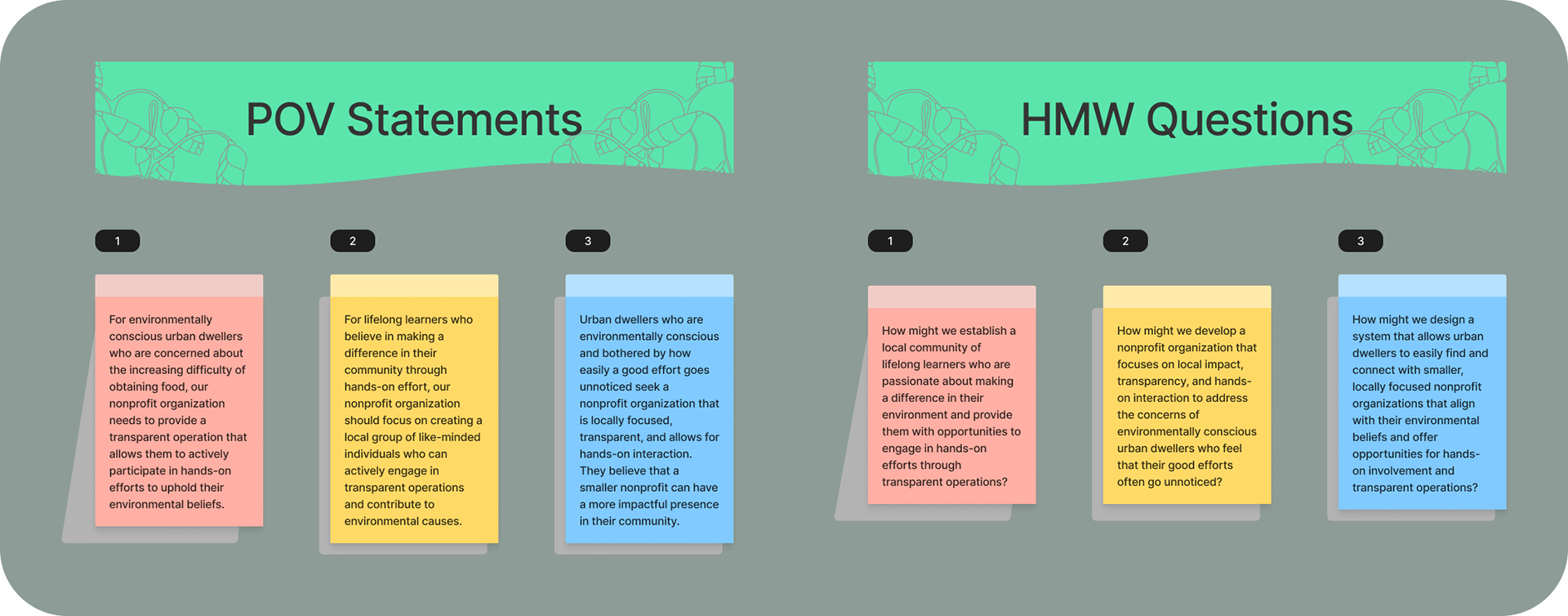
After synthesizing the research with the affinity map I was able to create insights and put them into "Point of View" statements that would be what a common user would look for. As well as "How Might We" questions to help me expand on ideas for a solution that users could benefit from.

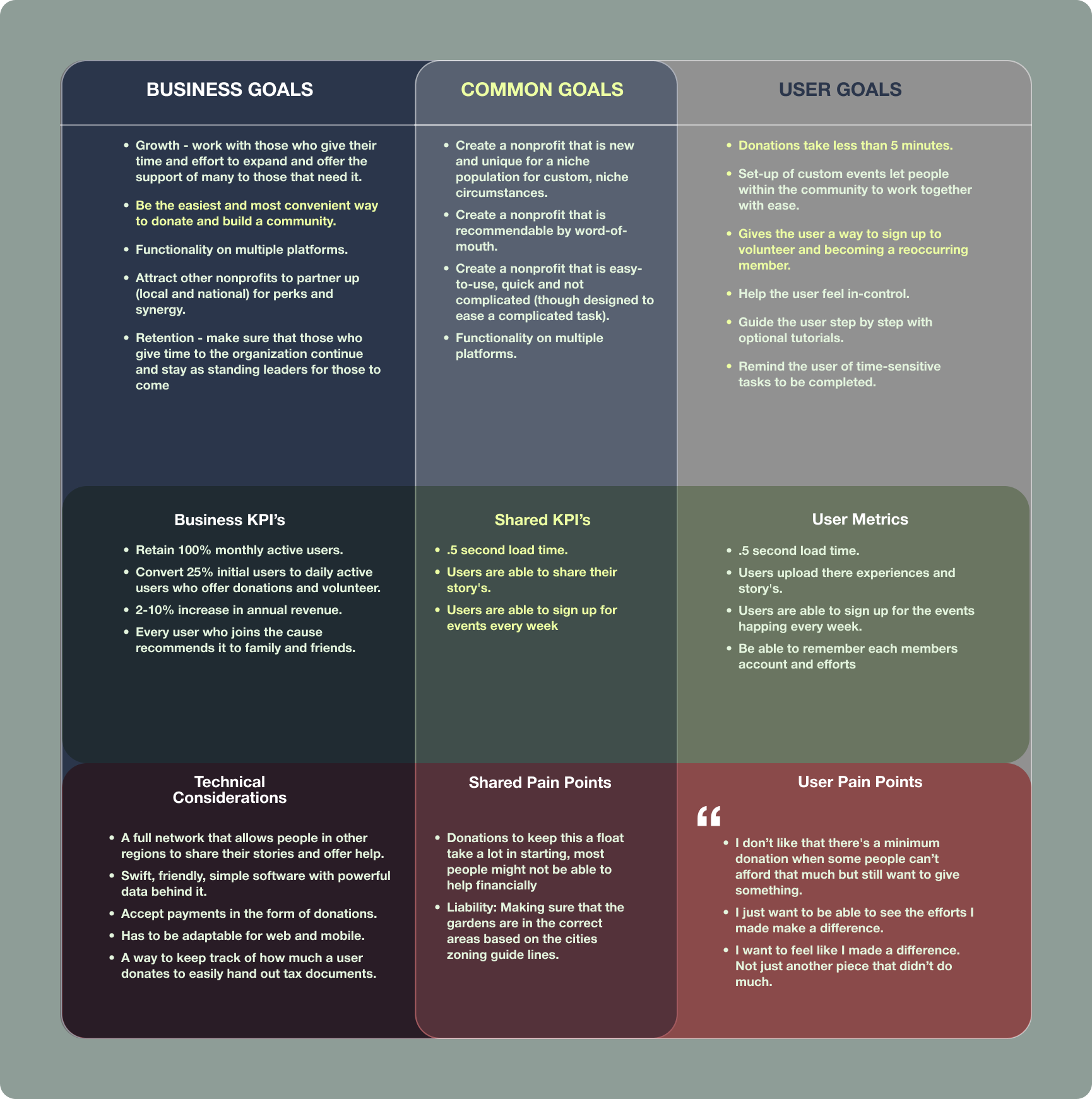
Between the research that I did and the insights that I made and put down I felt that a responsive web design was the best fit to bring attention to the community gardens that would be put in place. This would help bring attention and hopeful help to the cause at hand.
With this idea put in place I wanted to showcase how it would be viable within a business prospective. Regardless of this being a nonprofit organization, I understand that anyone willing to back this up would need to see how they could benefit. This would also include what would be the goal for this organization as it continues to grow.
With this idea put in place I wanted to showcase how it would be viable within a business prospective. Regardless of this being a nonprofit organization, I understand that anyone willing to back this up would need to see how they could benefit. This would also include what would be the goal for this organization as it continues to grow.

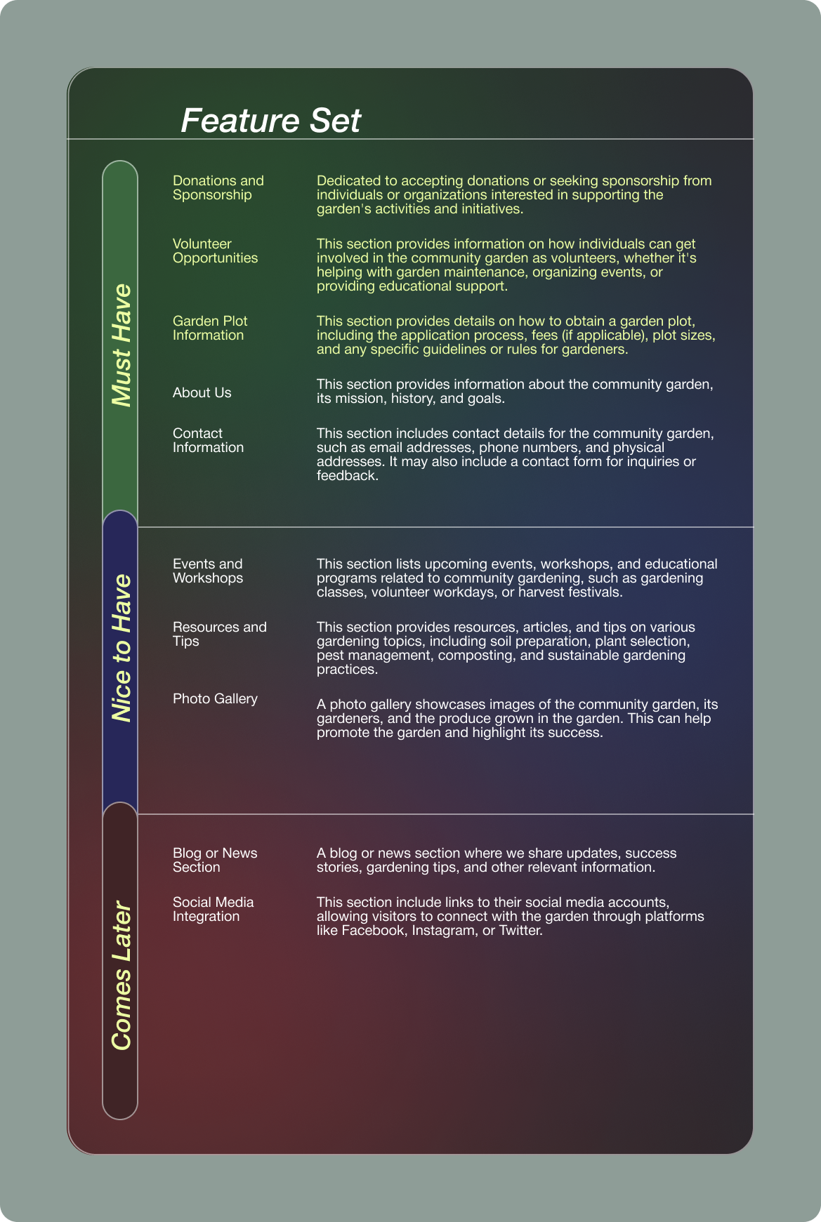
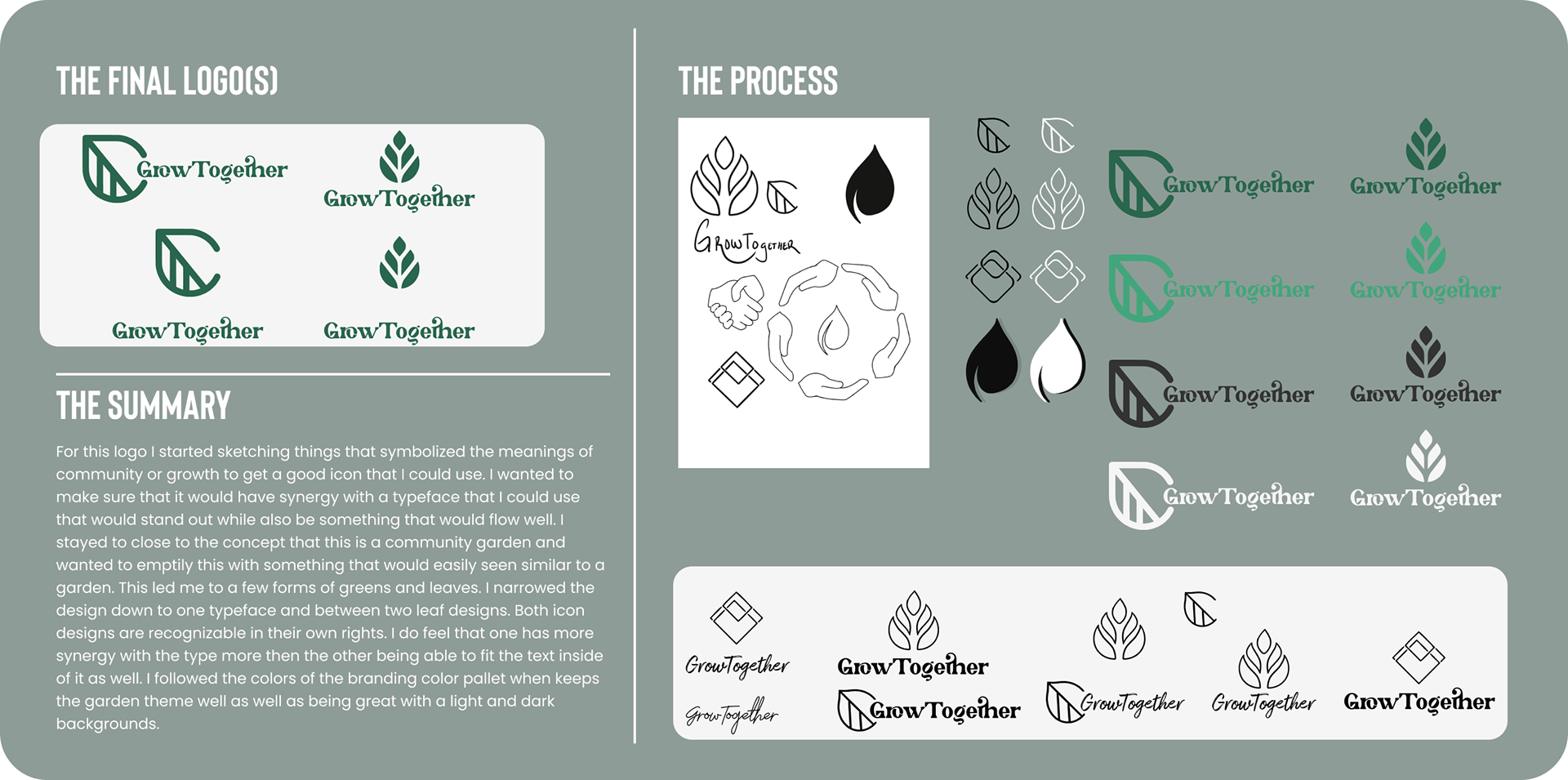
With a goal in mind I was able to move forward and start putting some goals in mind. I made sure to chose what would be need the most to make it stand out as a charity website. Making sure that the most need feature where the ones that I would work on first was the main consideration as I listed my thoughts down. What I've made is a Feature Roadmap as this shows what features I've thought of and what was a top priority and what could be integrated later in version updates.

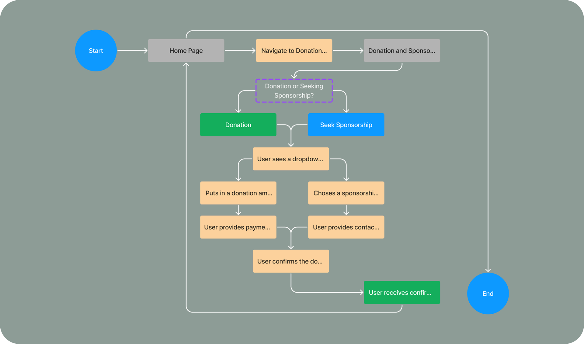
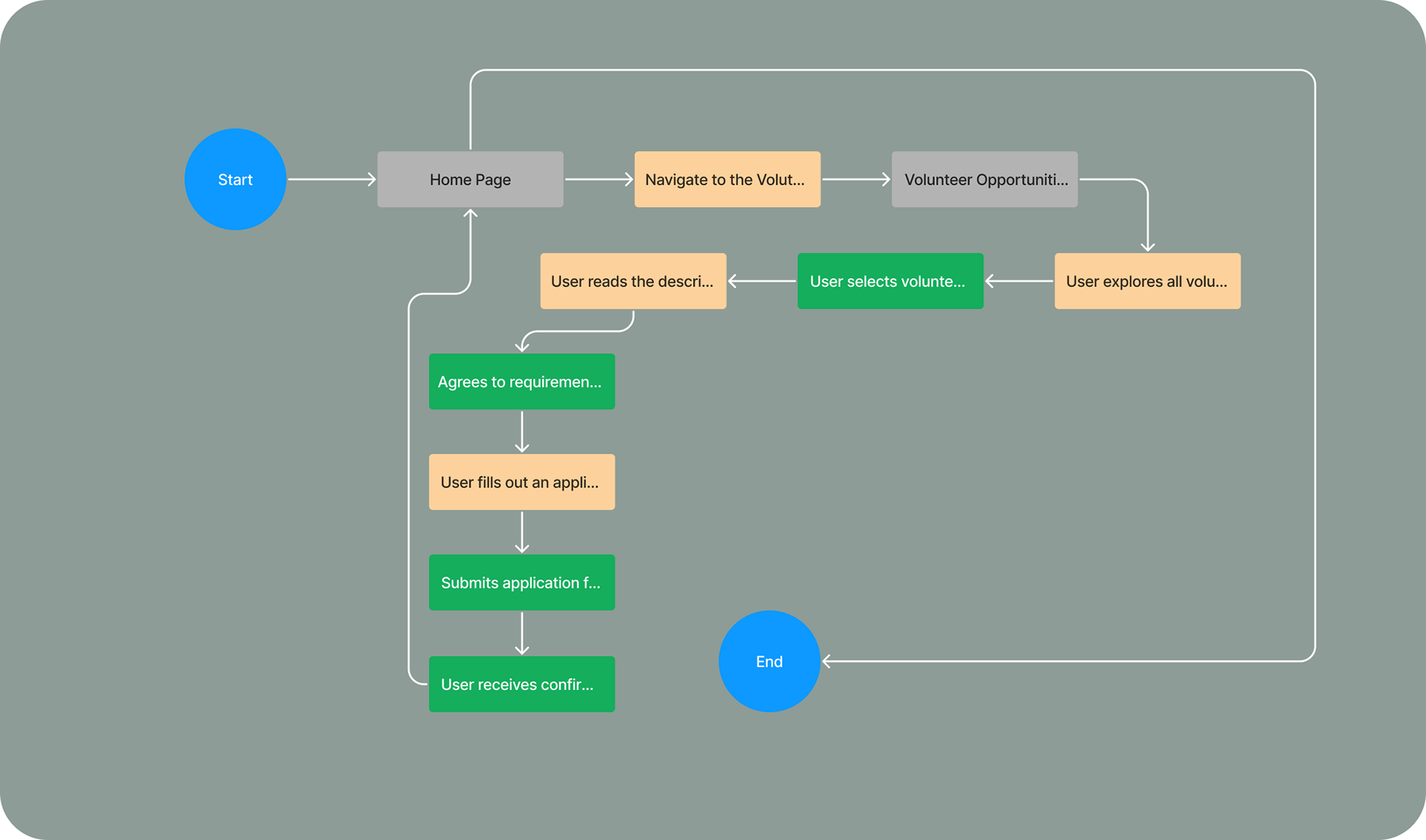
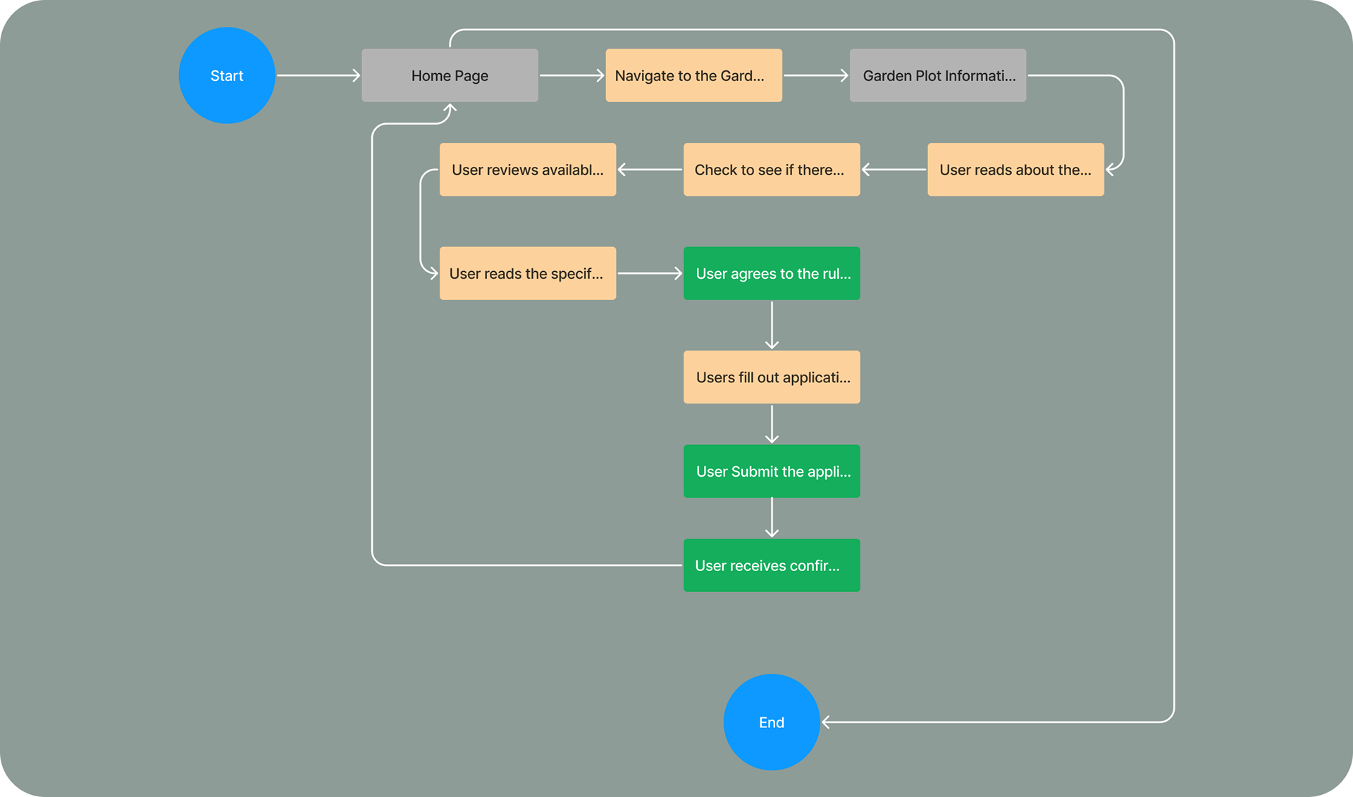
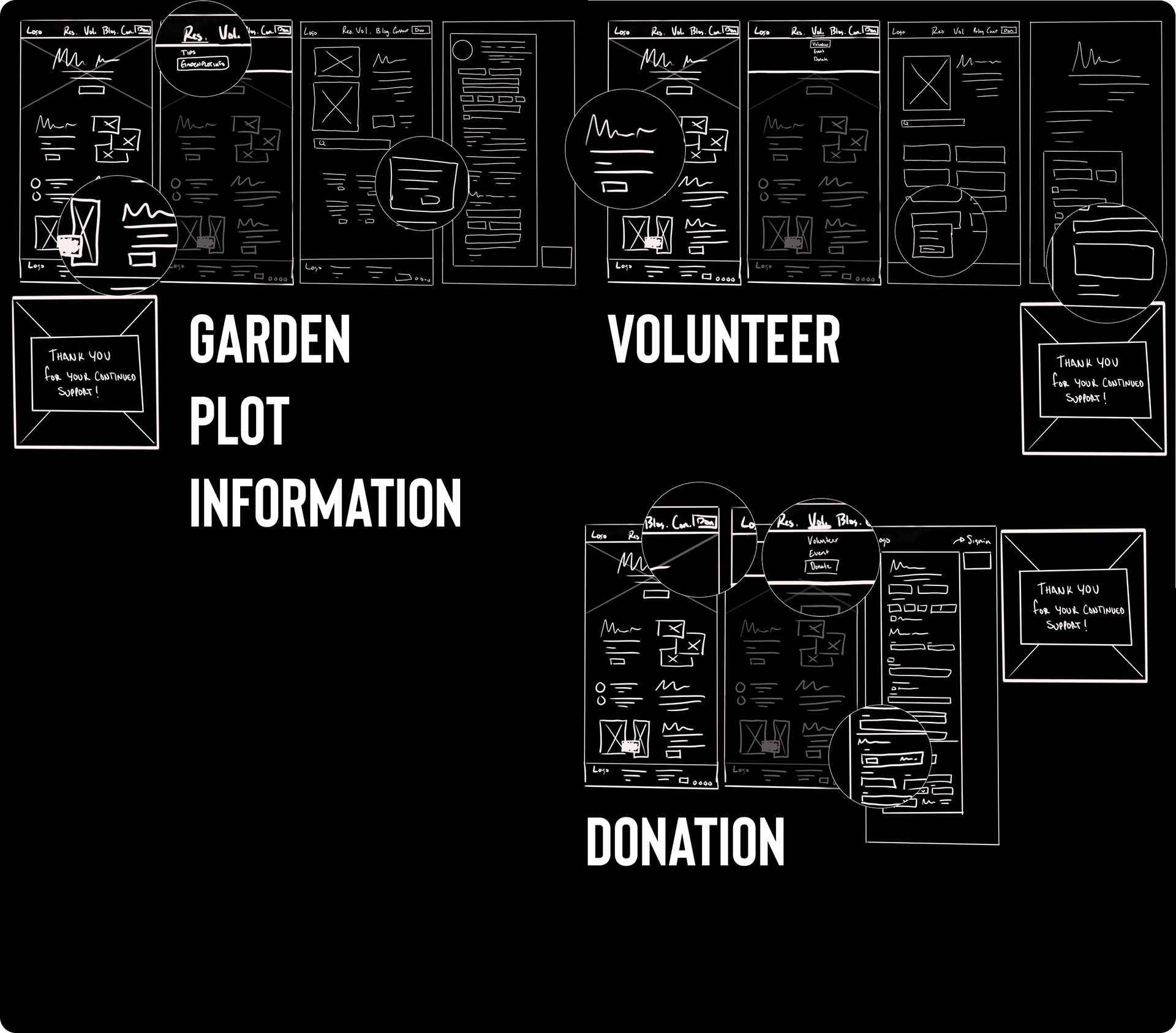
In this area I go over what a user would possible encounter or need to do while using GrowTogether. I go over the layout of the site and breakdown the areas that would be featured first and followed down as you continue through different pages.

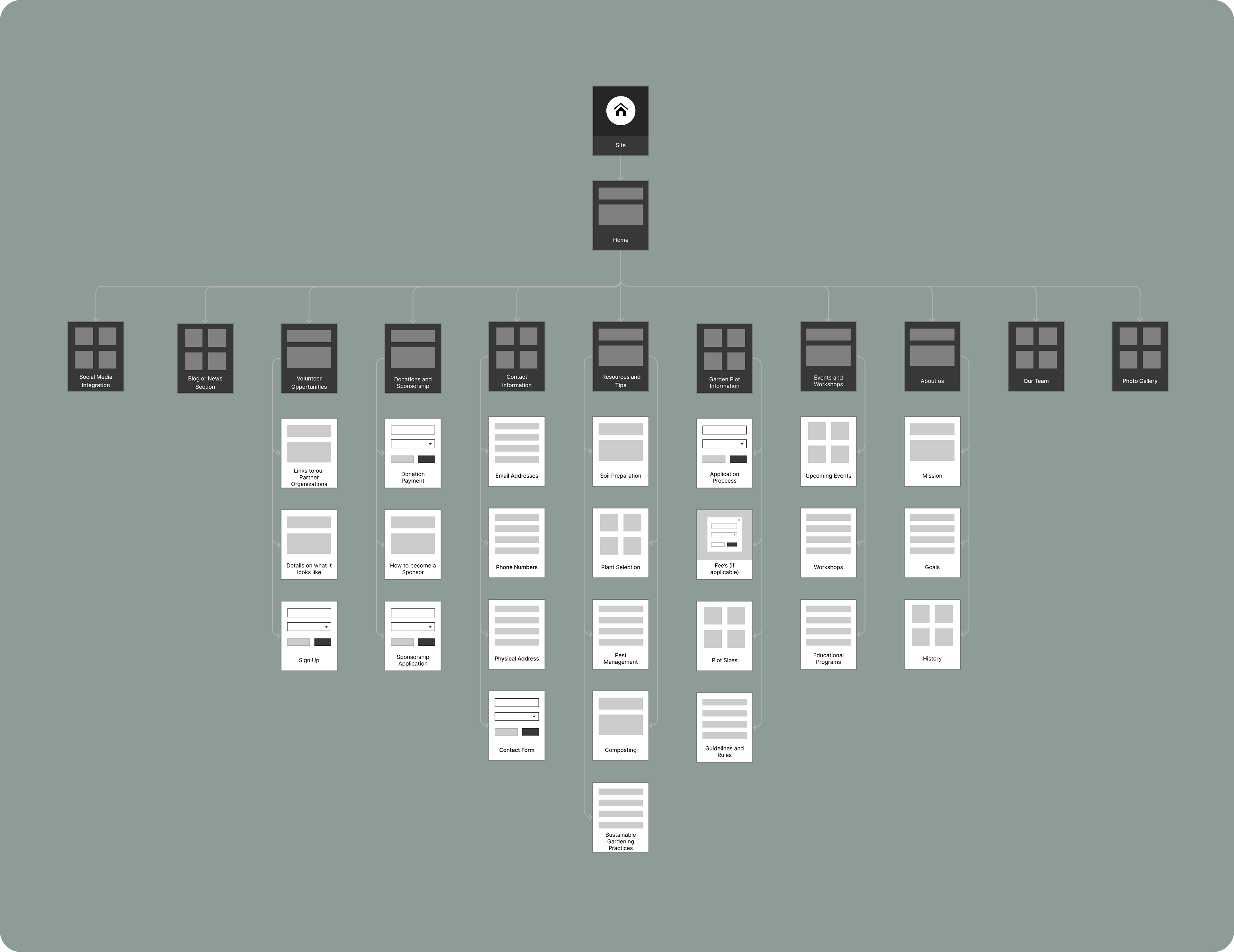

Donation Sponsorship
Volunteer Opportunities
Garden Plot information


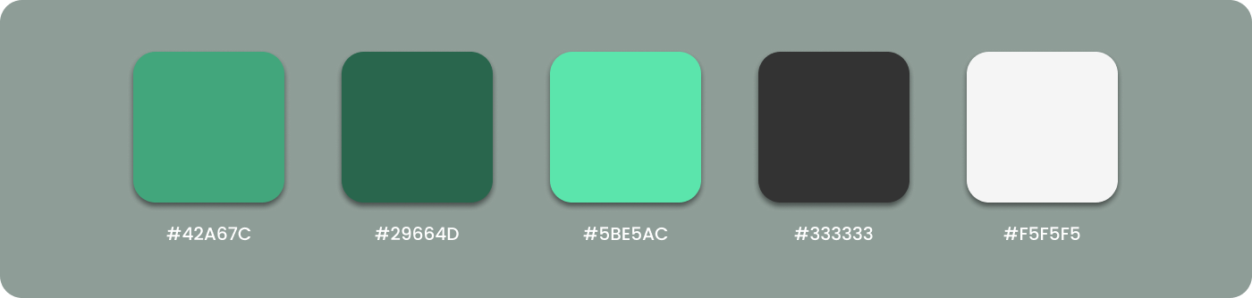
When choosing a color pallet I wanted to find something natural that would emphasize the content of the project, given that I was working on a community garden organization. I felt that using shades of green would help the visual impact of the content pop to the users.

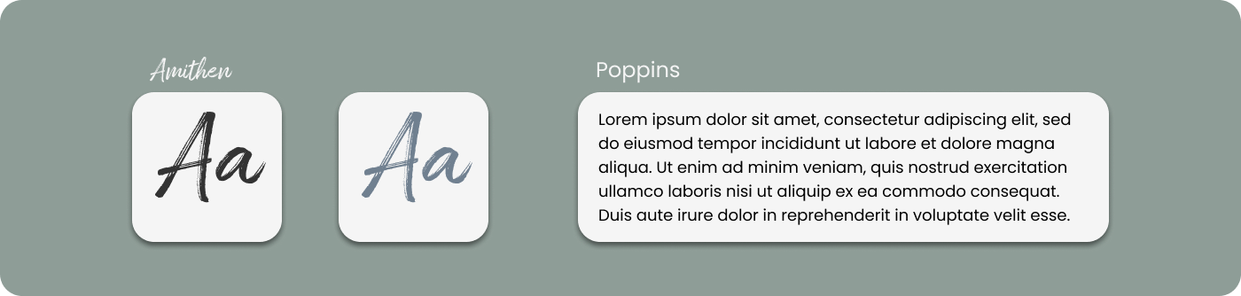
When finding a typeface to use, I wanted to aim for one that felt simple and airy. I want the user to feel at ease when reading the text. This project was primarily filled with text forms so using text that wasn't condensed or too thin would ensure easy contrast and less strain on the user's eyes.


To test a prototype of the following desgins click on the image of the final screens!

I conducted follow-up usability tests with the initial 7 participants to continue evaluating the design. The results were positive - all users found the system intuitive and easy to understand, completing 100% of tasks. They provided enthusiastic feedback about the visual design. While these tests validated the progress made, I sought opportunities for further improvement. With that goal, I attended a design critique group to gain outside perspectives. The feedback from my peers proved invaluable. They noted that condensing content areas using accordion-style text fields and visuals could streamline the user experience and better maintain engagement. Taking this advice, I recognized how simplifying complex sections through responsive design techniques helps reduce cognitive load. The iterative process of gathering multi-source feedback has helped strengthen my ability to identify and address usability issues, ensuring the design continuously meets users' evolving needs.

I gained valuable insights into creating engaging text fields for user input. I found that minimizing multi-step processes and breaking up dense blocks of text helps maintain user focus and satisfaction. Implementing subtle design techniques, such as adding sheer overlay layers to highlight typeface contrast, also helps important elements stand out and guides the user experience intuitively.