
A conceptual app created to help people find old or rare pop culture items and memorabilia through the connection of community and sellers alike. This app is the one-stop shop for all collectors or casual consumers to find what they’re looking for whether that be for nostalgic reasons or a growing collection. With a growing community of like-minded individuals, RareFinds is sure to be the one area to find what you're looking for with guaranteed quality and authenticity.


Have you ever had trouble finding those special limited edition collectibles you're passionate about? You're not alone. The hunt can be a real challenge, whether it's rare action figures, exclusive sneakers, or limited-run art prints. Hours spent scouring different websites, and forums, and even attending events to track down that one item you've been dreaming of. There is a lack of accessibility in this market and for those who own a business or are casual and want to stop relying on yard sales and side-based features on other apps to get money for their old or rare items.

The focus of this app is to bring down the time spent searching and listing items for all. I’ve created a one-stop marketplace specifically for limited edition collectibles, making it a breeze for you to explore, buy, and even sell these unique treasures. Say goodbye to the endless search and hello to a world of exclusive finds, all in one place!


Participants/ Interviews
During the initial start of this concept I played around the thought of what users would want from this e-commerce app and what could improve their lives for this reason I chose to interview a small pool of 7 participants in which four had or have their own shop/business and the other three have experience collecting and buying niche or rare collectable items. This group of participants was able to help me gain insight within what each side of the application would look like. As well as pain points and frustrations from each side.
Insights
During the Interviews that I was able to conduct I noticed a pattern of frustration amongst those user that own or operate their own shop. These issues consisted of: “Time Taken to Complete a New Listing”, “Accessibility to Personal Forms of Media”, “Organization of Tags and Other Description Fields”, and “Ease of Conflicted Resolution with Orders and Shipping”
Whereas the users who focused on collecting and buying items on sights tend to find similar issues of a site offering other items rather than informing the user that the item they searched for was out of stock or none available.
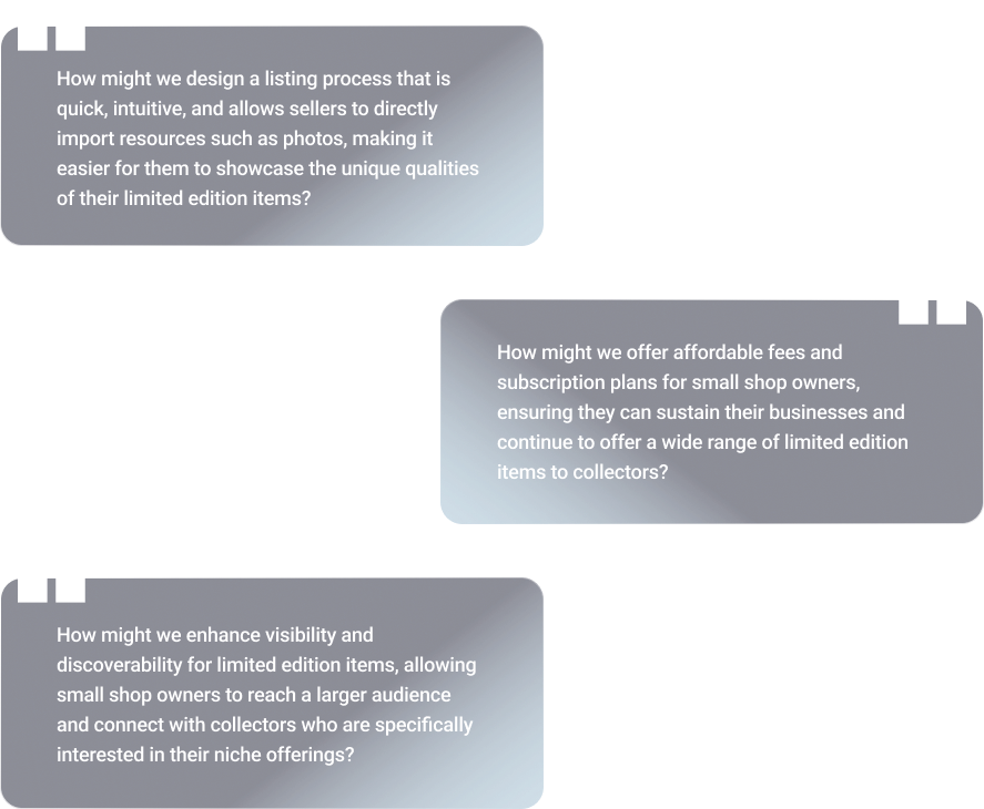
With the two side weighed out I decided to focus my efforts towards the sellers of the group. These insights set a base for my next steps within my design process for RareFinds
Whereas the users who focused on collecting and buying items on sights tend to find similar issues of a site offering other items rather than informing the user that the item they searched for was out of stock or none available.
With the two side weighed out I decided to focus my efforts towards the sellers of the group. These insights set a base for my next steps within my design process for RareFinds

I decided to check similar companies and applications which focused on a good e-commerce experience with the focus of what these applications offered to the shop owners and what would make someone want to operate a shop with them. Then after using and referring reviews and other personal experience within these apps I identified the major challenges and other common issues others have found.
• Too broad of a market for smaller owners to compete with.
• Lack of personalization within the online store.
• Limited branding access.
• Overwhelming text amounts.
• Outdated UI elements.
• Lack of text inputs.
• Too broad of a market for smaller owners to compete with.
• Lack of personalization within the online store.
• Limited branding access.
• Overwhelming text amounts.
• Outdated UI elements.
• Lack of text inputs.

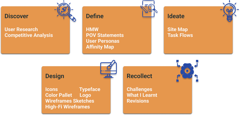
To keep my thoughts in the mind as I continued the design process I decided to compile the research information in the form of an affinity map. This gave me a way to easily look back at what my participants had said about their experiences to keep me motivated to curate a product in which would best serve their needs.
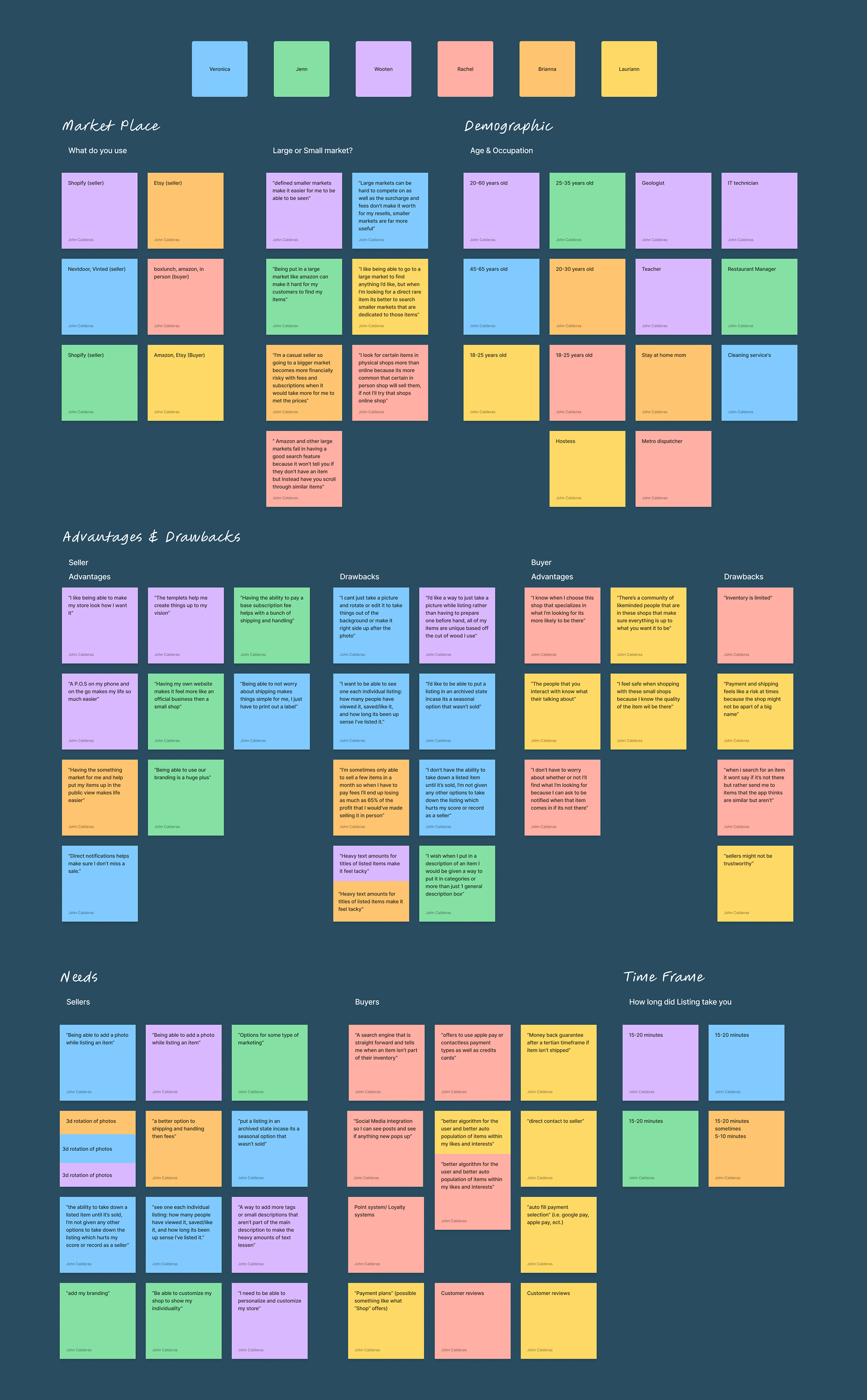

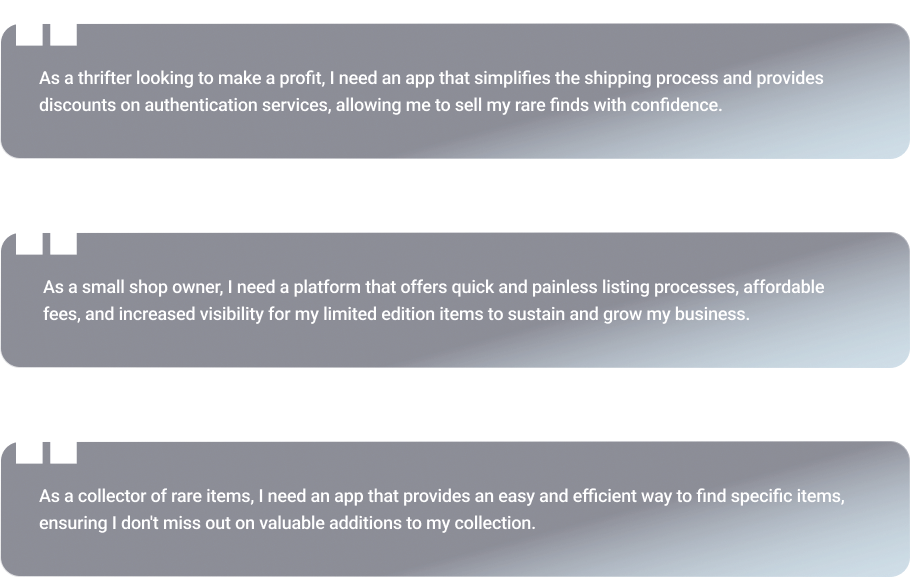

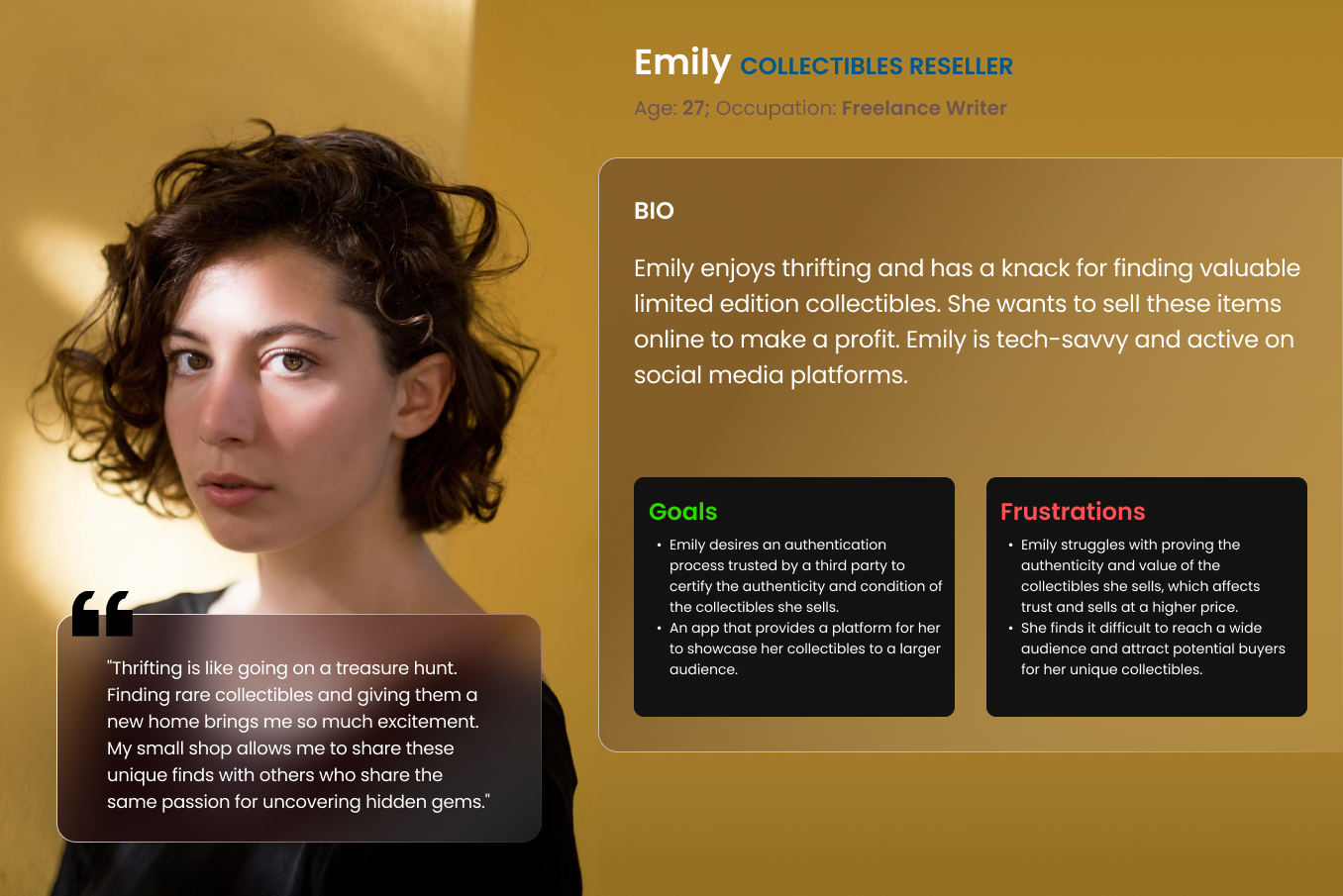
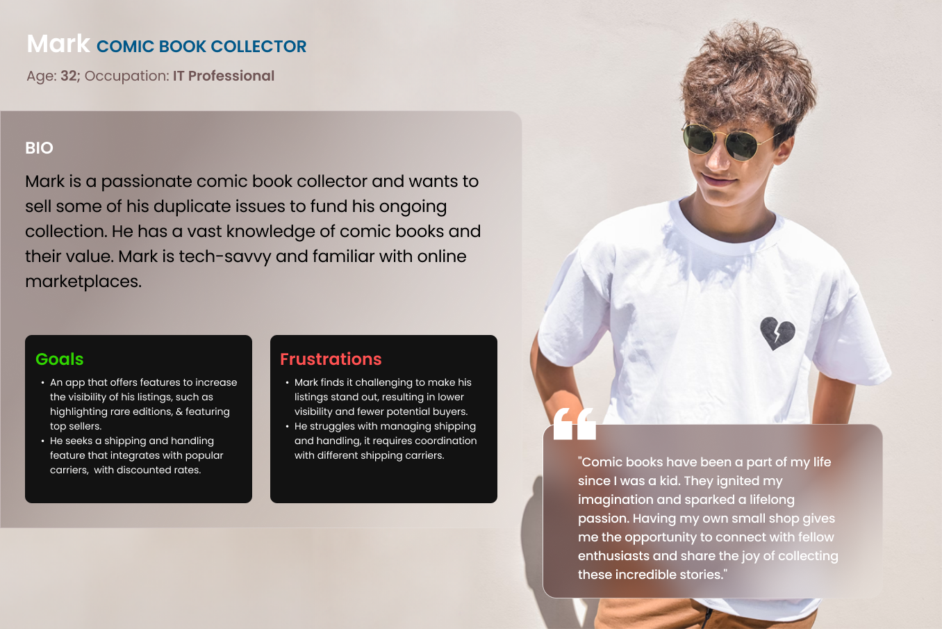
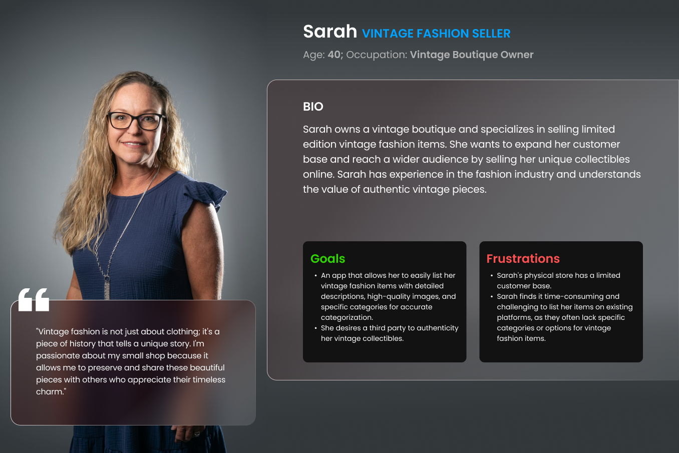
To showcase potential types of users that would use this app I design some user personas which are quick example of different professions and needs that would bring someone to use this product over other similar products in the market.

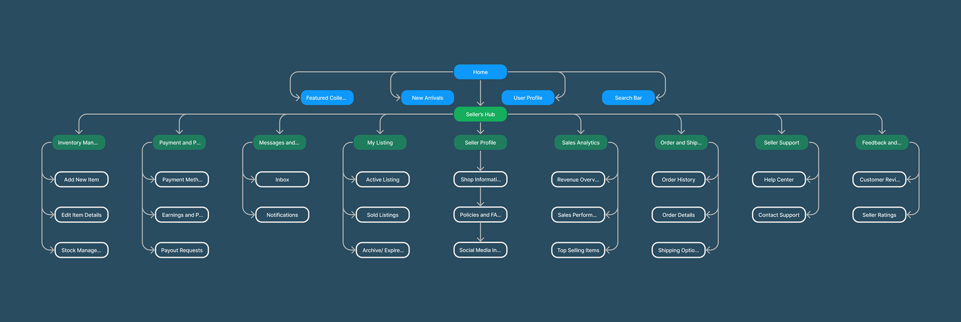

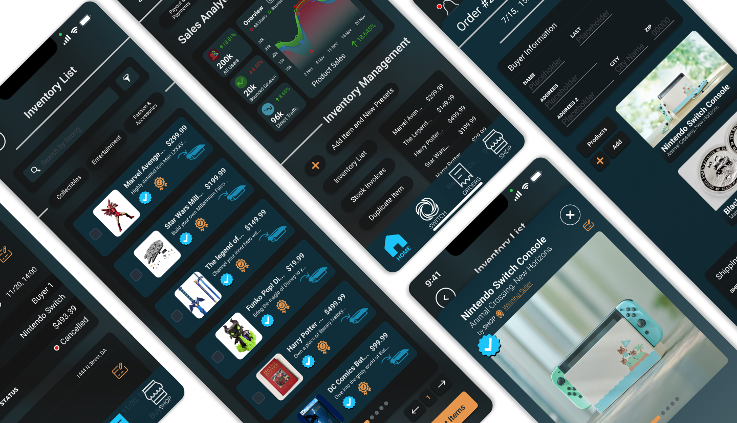
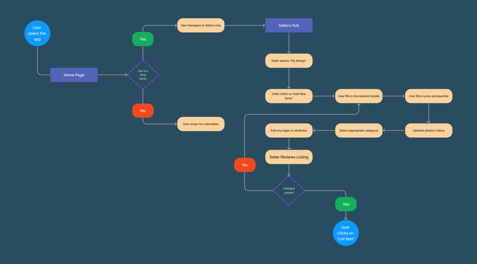
New Listing's
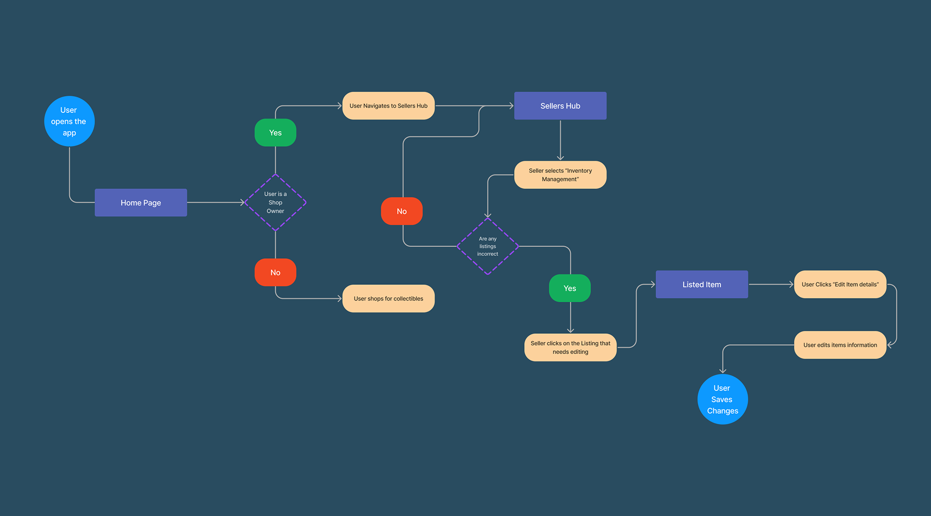
Editing Item's Listing
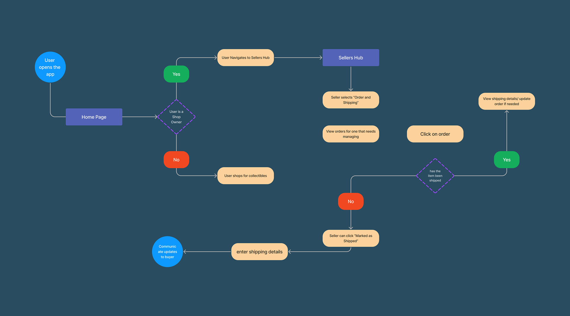
Orders and Shipping

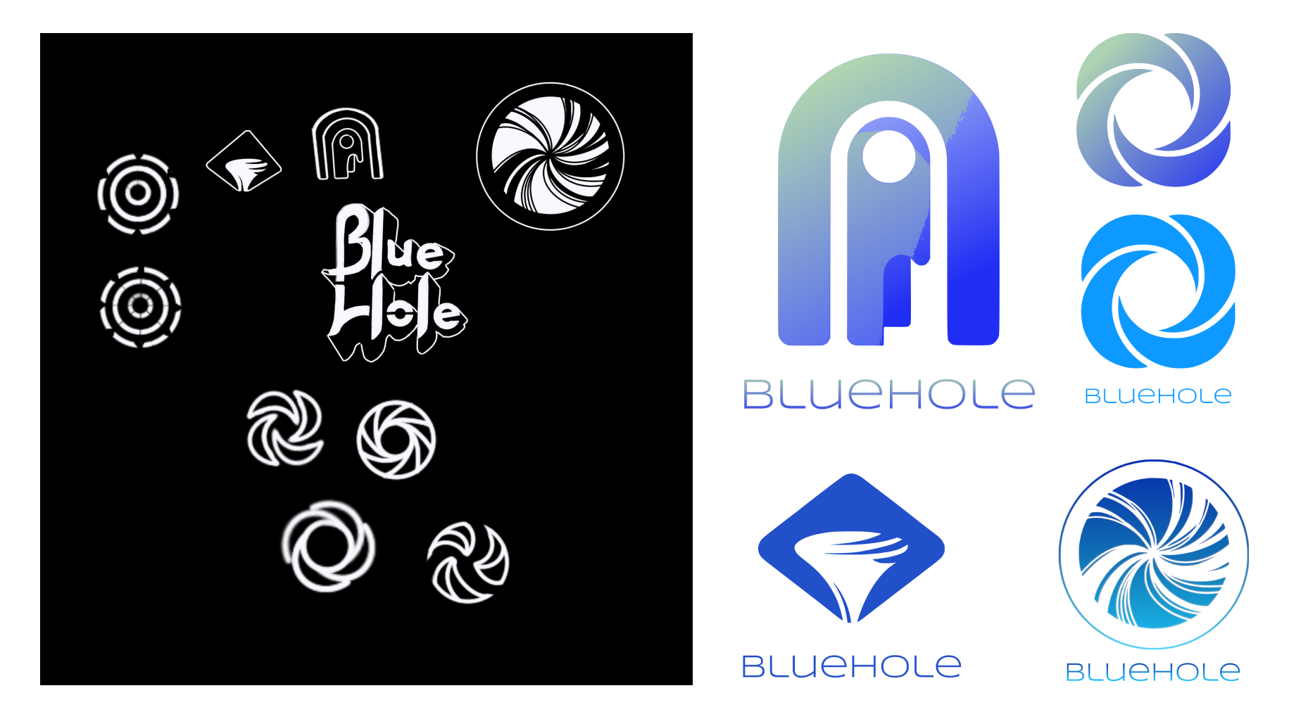
Creating branding for this concept led me to try out a few abstract names for the app itself. I tried to illustrate how products could be named one thing but associated with another. After a few attempts at other names, I landed on Bluehole.
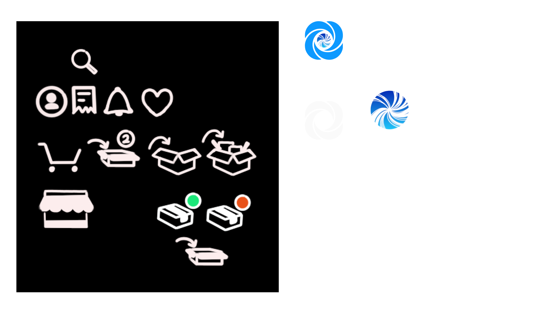
Icons
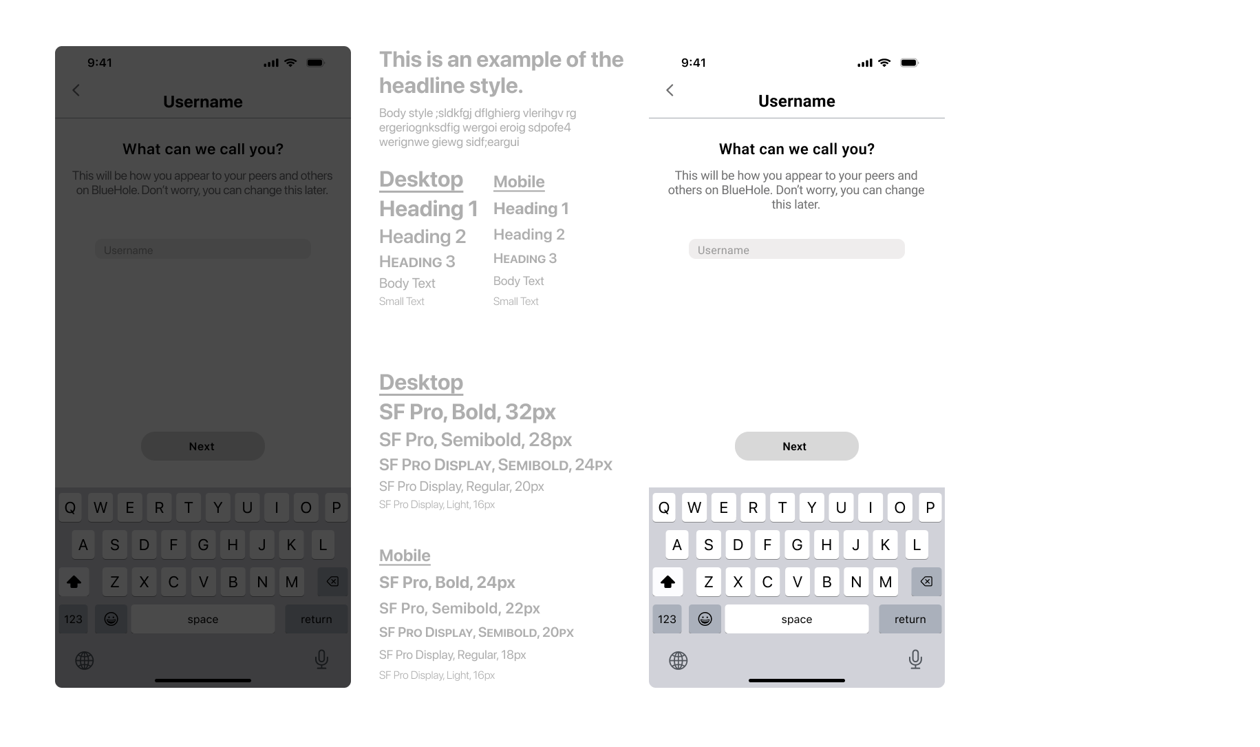
Typeface choice
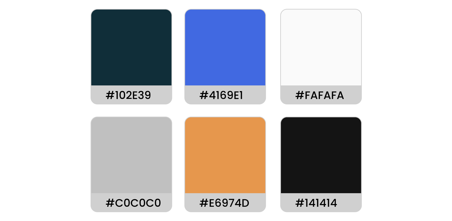
Color Pallet
The color pallet I used for this app was chosen in hope of increasing a soothing and more productive environment for the user. I found during my research that finding rare or exclusive items which may not be in production any more can cause users to grow some anxiety when searching. using the dark and cool colors contrasted by the orange to highlight important areas should help with this.
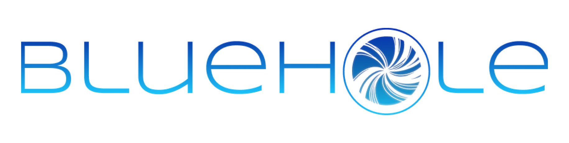
Logo
When I was thinking about the logo I wanted to play with the name to have a strong wordmark one that users would be able to think of immediately when someone would bring it up.

Low-fidelity
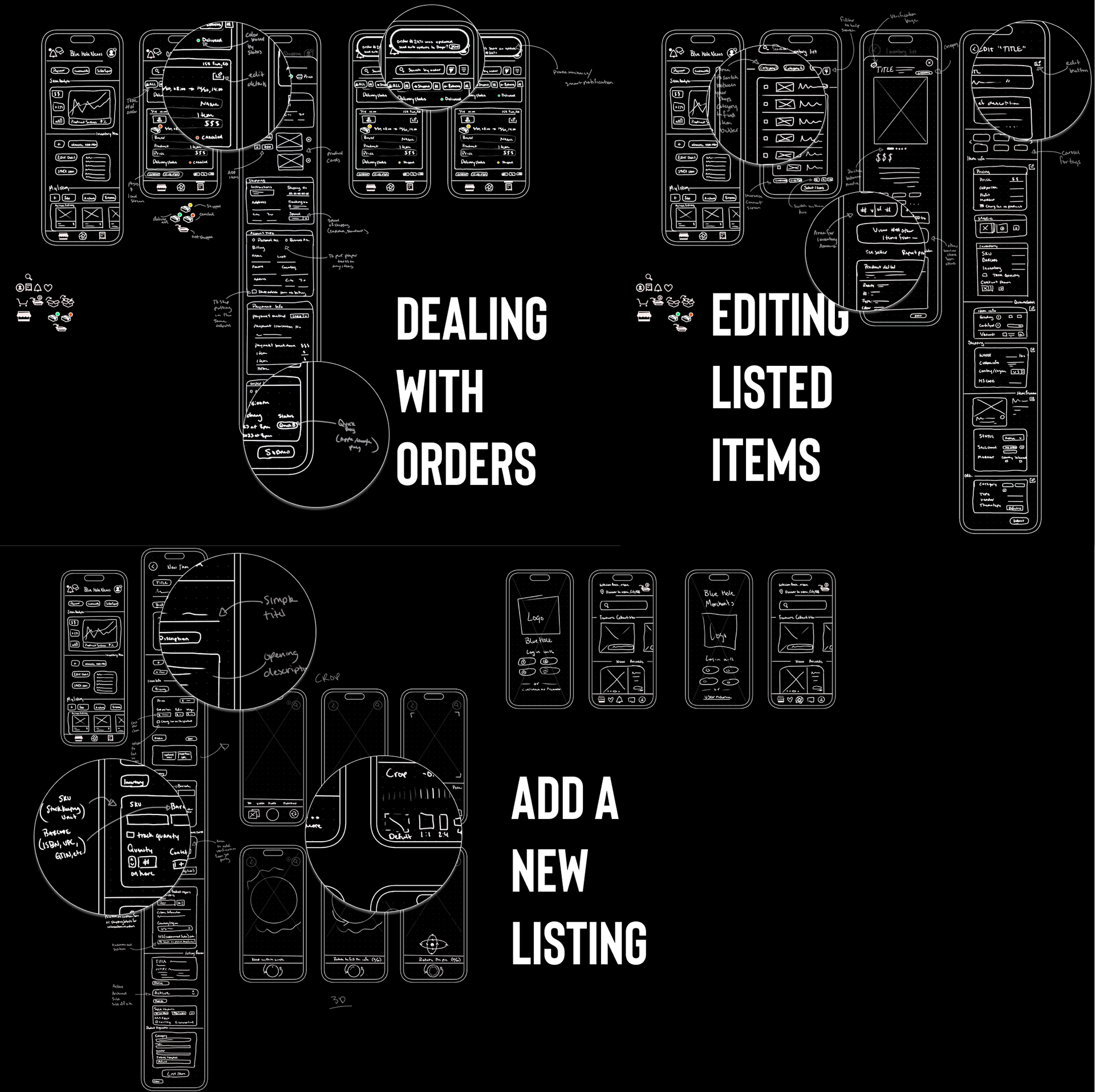
While focusing on the concept of the frames, I knew that following the task flows that I had mapped would be the best way to get a comprehensive working app. I soon realized the amount of information that is needed to properly list an item that can stand out was riddled with large amounts of inputs for the user as well as long texts amounts that the user would have to read. My focus quickly switched to making sure that the usability wasn’t overwhelming or un organized. To do this I researched every commonly needed input and what each field meant to the user and the success of listing the item to properly organize and put together an easy to use system.
High-fidelity
Following the detailed sketches, I made sure to keep the design features in mind while insure ease for the user by how it was to be organized.
To test a prototype of the following desgins click on the image of the final screens!
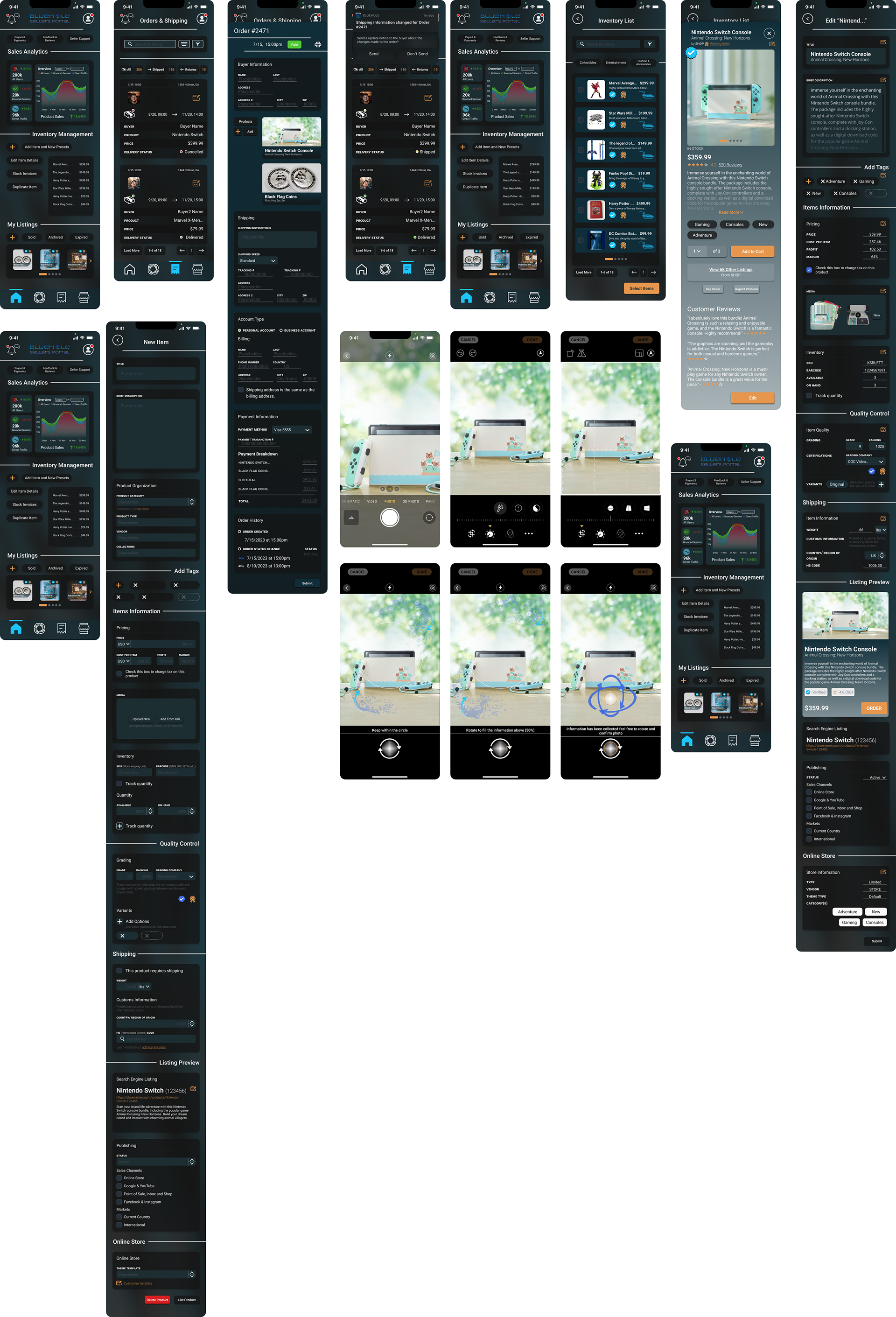
In the primary interviews that I conducted a majority of the participants explained their frustrations with how media was added and how long listing the item would take. I did my best to add ease to the user with a built in camera function with a option for 3D photos. I looked as this as a way for users to cut they time down when listing.

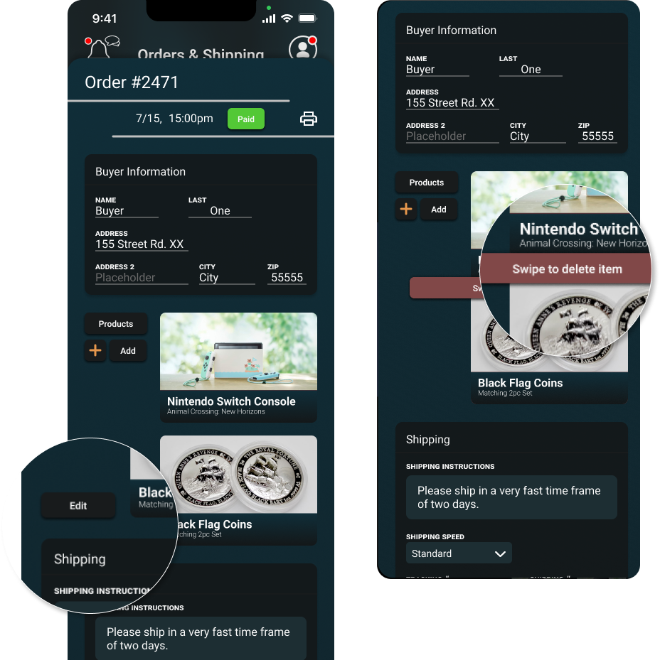
During user testing of the Bluehole prototype, I observed a common struggle among participants - finding how to delete an item from an order details page was unintuitive and caused delays as they searched for the method. To address this issue, I added an "Edit" button that pops up a banner informing users how to delete an item. Additionally, most testers expressed dislike for the name "Bluehole," which prompted me to reconsider it. Taking this valuable feedback into account, I changed the name of the app from Bluehole to RareFinds to improve the user experience and perception.


My work focusing on the backend of a system taught me several valuable lessons. Through developing functionality first, I learned that usability is key, and text-heavy fields often lead to disengaged users struggling to navigate options. Streamlining processes by reducing guesswork for the user creates a more intuitive experience. These insights reinforced how crucial considering the end-user perspective is during creation. Following these formative experiences, I gained an appreciation for designing with the user in mind from the start to develop products that intuitively meet real needs.