
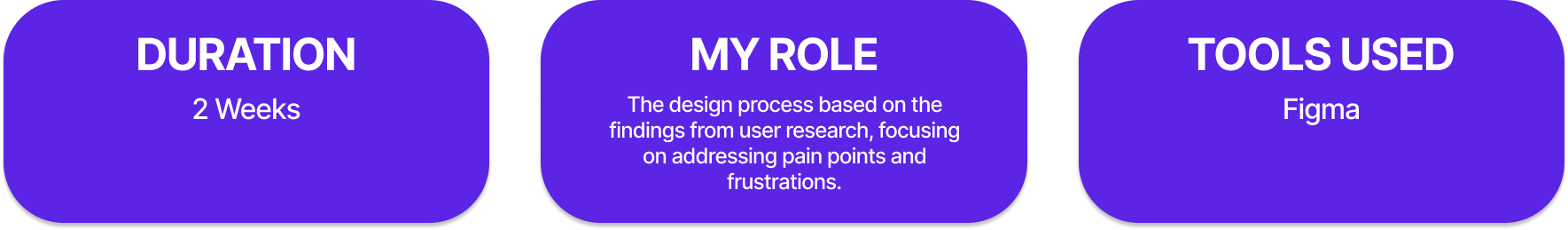
Created by ADP, Wisely puts you in charge of your money and give you more flexibility and control at every step. As a conceptual project I took a chance to see what users had to say about using the app in their everyday lives. As well as a chance to take on and understand any pain points and frustrations that may be associated with the Wisely app. Finding a solution to the issues that user face is the ultimate goal while working within the existing branding and style of the known application.

The limited options for fund transferring in the Wisely mobile banking app present a significant constraint for users. Expanding the available methods for transferring funds is crucial to provide users with more flexibility and convenience in managing their finances. This issue needs to be addressed to enhance the overall user experience and meet the diverse needs of the app's user base.

To address the limited fund transfer options in the Wisely mobile banking app, expanding the range of transfer methods, such as adding support for instant transfers, peer-to-peer payments, and external account linking, could significantly enhance user convenience. Additionally, integrating with popular payment platforms and enabling international transfers would provide users with a comprehensive set of options for managing their funds. I aim to offer a more versatile and user-centric fund transfer experience, catering to a wider range of user preferences and needs.


To get a better understanding of what pain points users had I did a survey with 20 people who use and have the app. This survey was a way for me to see common issues that users have as well as a way to see the usage rate amongst the participants. Out of 20 people 5 people admitted to using the Wisely app. I was able to interview these 5 participants to get a better understanding of why they use the app and what frustrations they may have had.
SOME ASKED QUESTIONS:
• When was the first time you used the app?
• What challenges do you face while using the app?
• What do you feel makes this app unique and stand out?
• Tell me about what about your experience with the app do you like?
• Tell me is there anything that you’d like to see changed within the app?
These are some of the take aways from the interviews:
• Users agreed that the UI seemed a bit out of date.
• They explained that the app felt a bit clunky.
• They all felt that if the app offered a “Instant Transfer” feature they would enjoy the app more
• They felt overwhelmed by all the fee’s that came with the card.
• The saving features that the app offered seemed like the main priority of the app over other features.

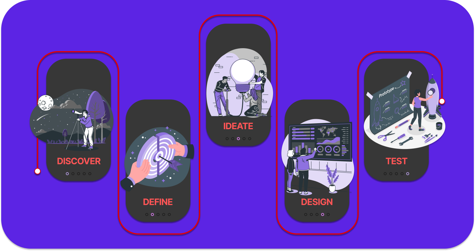
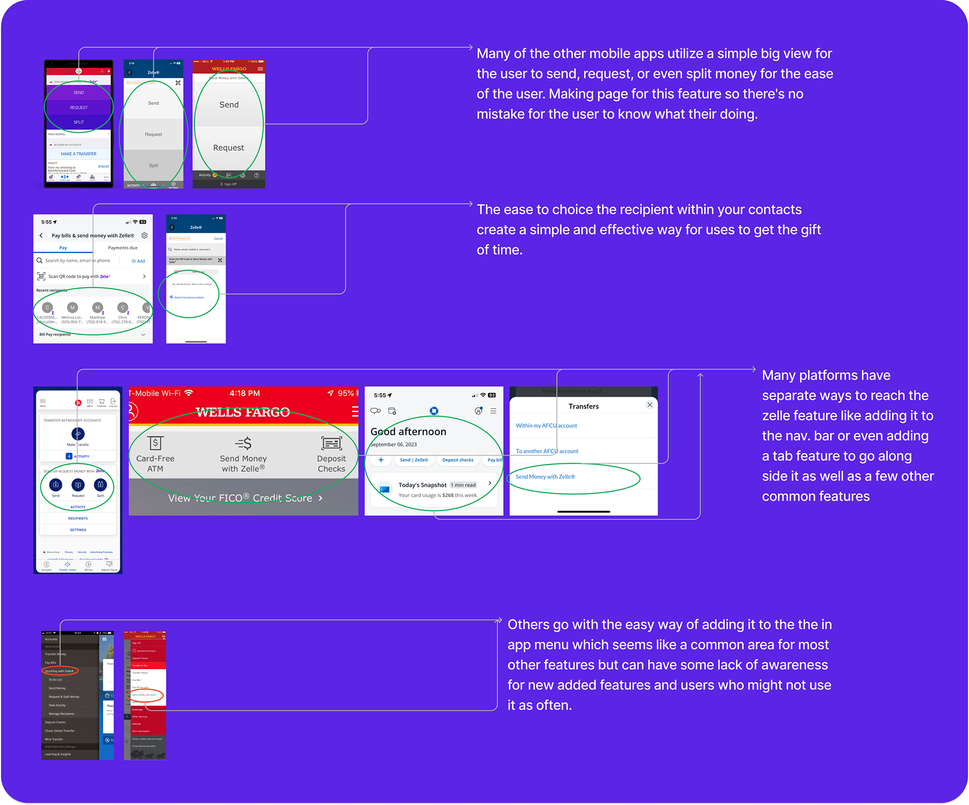
I dedicated time to thoroughly evaluate various mobile banking apps to discern differences in branding, design, and features. Following comprehensive user research, it became evident that integrating "Zelle," an instant transfer feature present in other apps, could effectively address a majority of the user's concerns. Therefore, during my research on design patterns, I placed particular emphasis on the Zelle feature utilized by other apps.


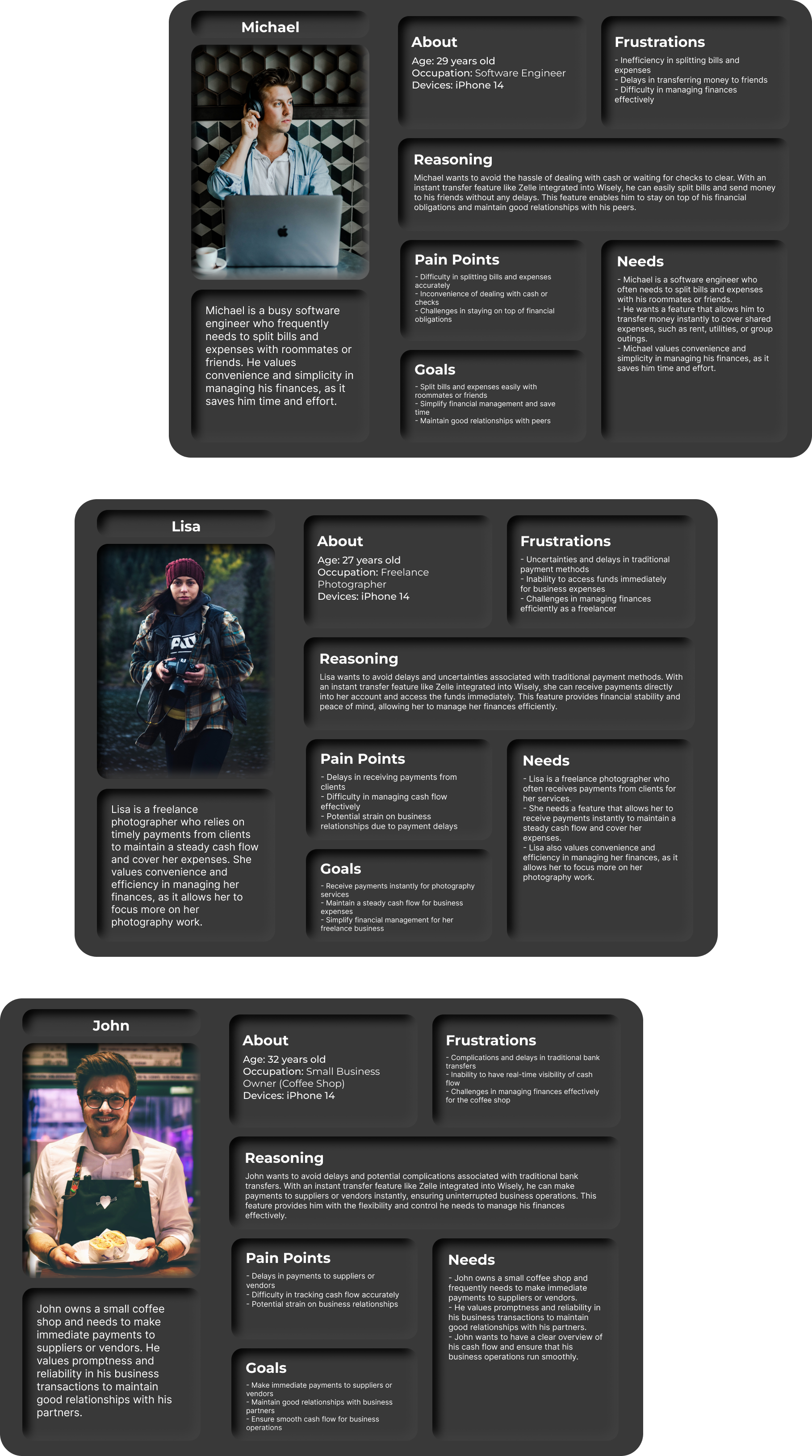

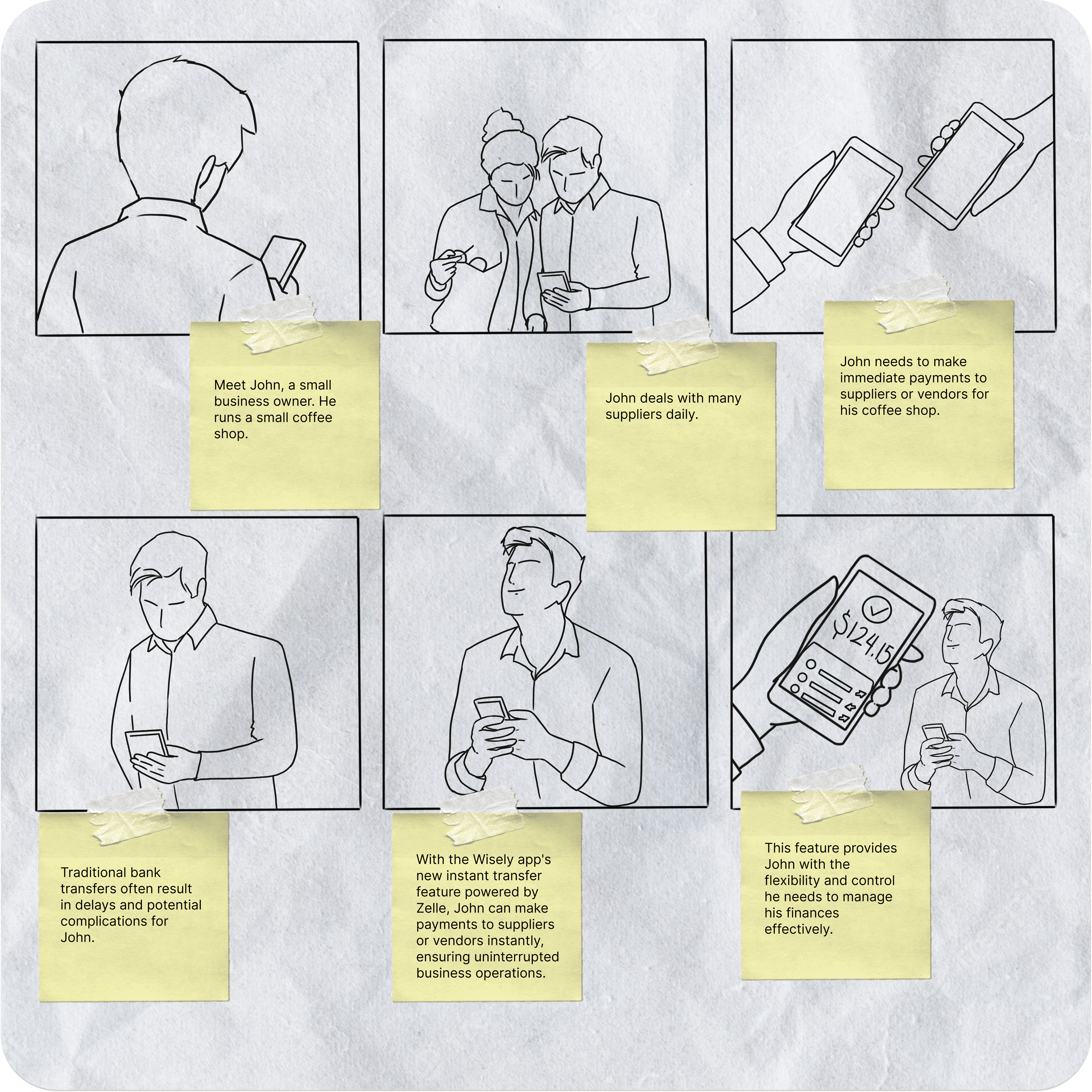
After compiling my thoughts from the interviews and initial research I conducted. I used these insights in conjunction with the personas above to create a storyboard to give a visual of what it would look like for a common user to have a need for an instant transfer feature. Like the saying goes a picture can say 1000 words.


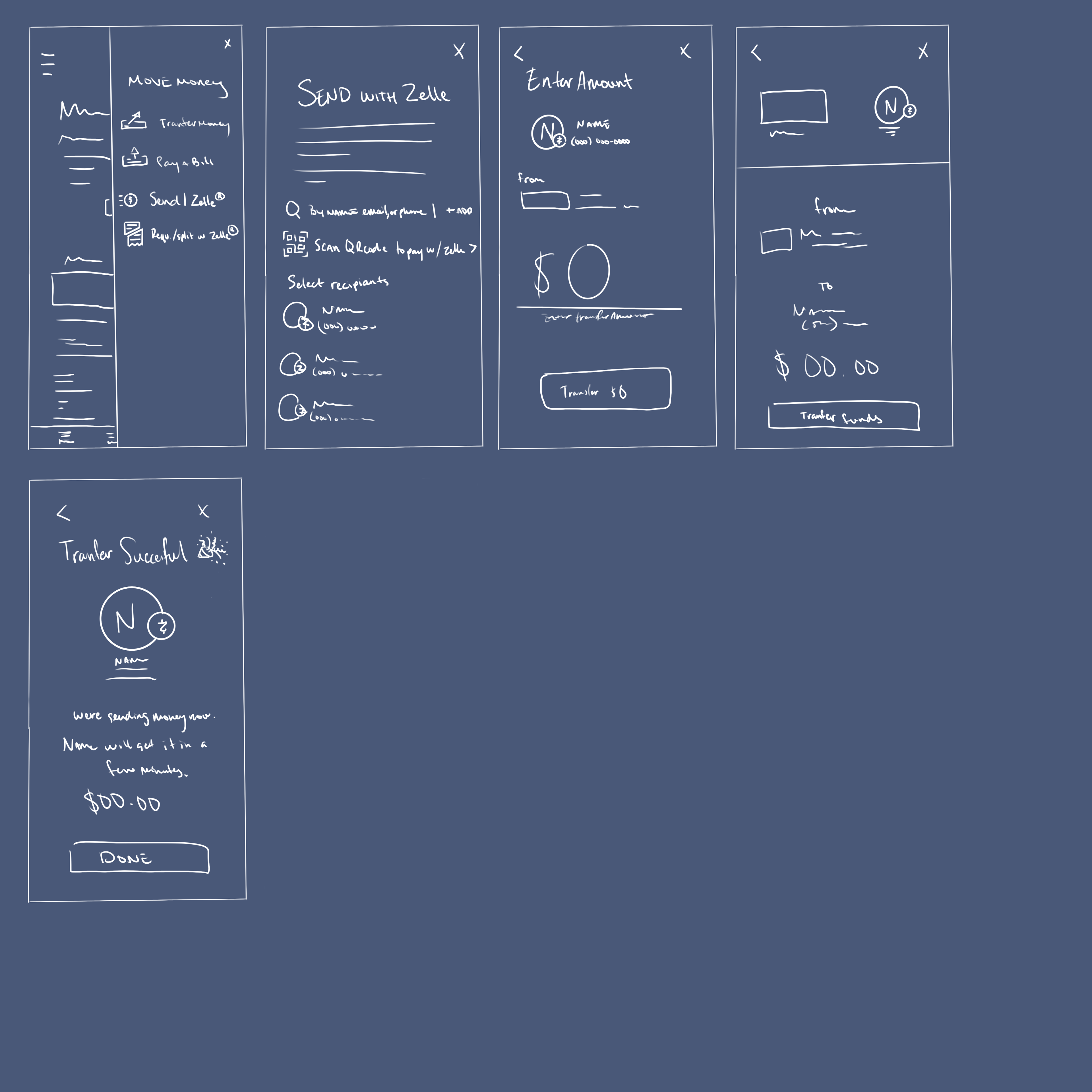

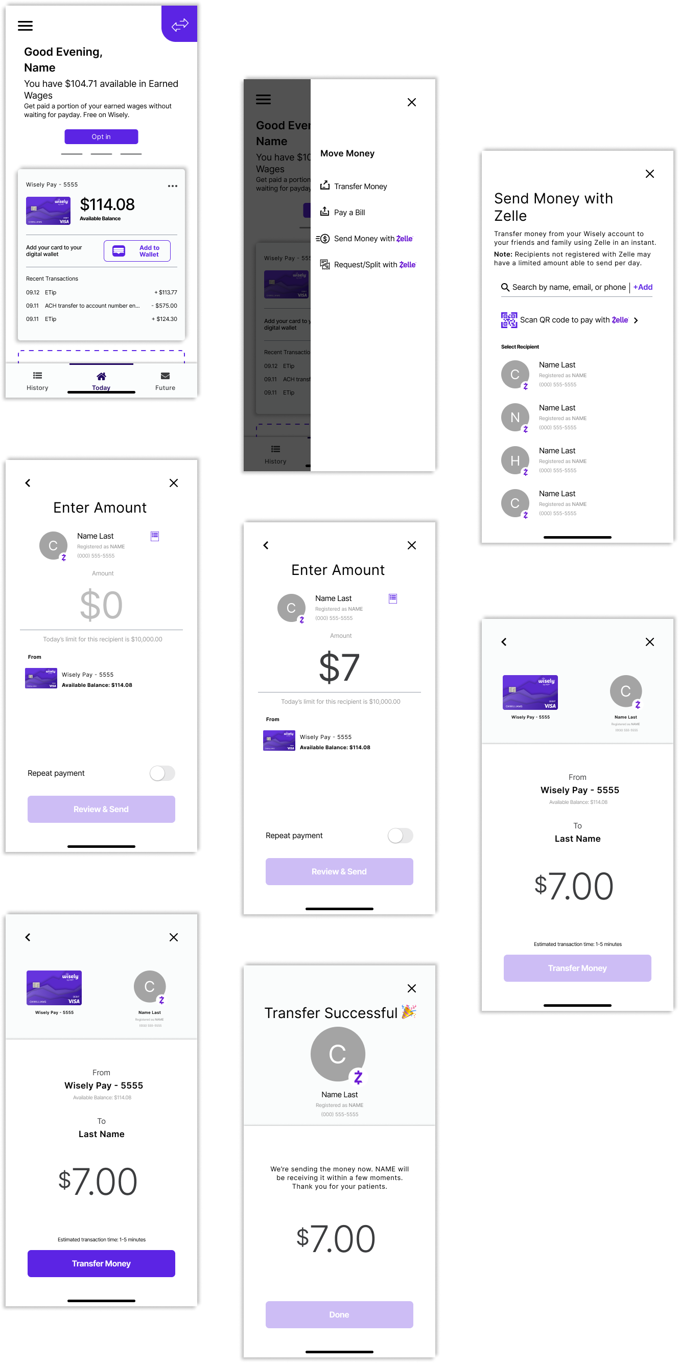
To test a prototype of the following desgins click on the image of the final screens!


I contacted those who were part of my survey and my first interviews. I walked the participants through the certain task which in turn provided interesting insights on the user experience.

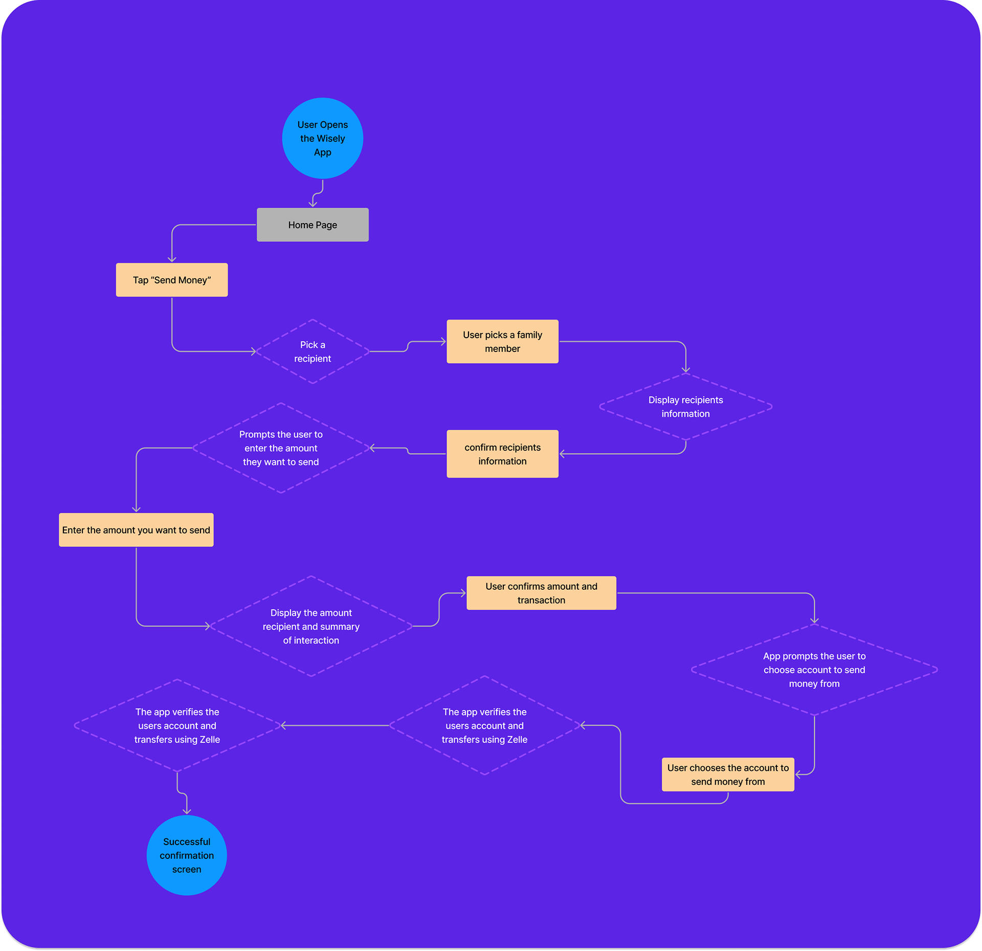
Sending Money To a Friend Using Zelle

• To check to see if the process of choosing a recipient is intuitive.
• To see if the participants are able to finish the task in a timely manner.
• To test that the overall process is easy.
• To see if the participants are able to finish the task in a timely manner.
• To test that the overall process is easy.

The app was simple to understand and easy for those who had and hadn’t used the app. All of the users were able to finish the task with no issues and all agreed the added feature improved the apps quality greatly.

While working within the confines of an existing design system and its branding guidelines, I found maintaining strict adherence to be challenging at times. There were elements I wanted to enhance or expand upon in a way that could help elevate the visual hierarchy. However, the changes I had in mind would have pushed the overall style slightly outside the guidelines. Being able to propose iterative improvements to an established product helped deepen my understanding of how design approaches can vary. In the end, I learned that simplicity is often the most effective approach, and subtle adjustments can make a big impact.